Utilising CSS Grid & Flexbox
Using flex to control the layout
PROModule Outline
- Source Code & Resources PRO
- Lesson 1: Introduction PUBLIC
- Lesson 2: The Difference Between UI and UX PUBLIC
- Lesson 3: General Concepts PUBLIC
- Lesson 4: A Brief Introduction to Accessibility PRO
- Lesson 5: Navigation Concepts PRO
- Lesson 6: Actual Performance & Perceived Performance PRO
- Lesson 7: Controlling the Layout PRO
- Lesson 8: Utilising CSS Grid & Flexbox PRO
- Lesson 9: Creating a Layout That Adapts to Desktop PRO
- Lesson 10: CSS Variables and Syntactically Awesome Style Sheets (SASS) PRO
- Lesson 11: Improving Form UX PRO
- Lesson 12: Animating with CSS PRO
- Lesson 13: Animating with Angular PRO
- Lesson 14: Animating with Ionic and the Web Animations API PRO
- Lesson 15: Animating with Javascript PRO
- Lesson 16: Scalable Vector Graphics (SVG) PRO
- Lesson 17: Conclusion PRO
Lesson Outline
Utilising CSS Grid & Flexbox
When designing interfaces in Ionic it is useful to have at least a basic understanding of CSS Grid and Flexbox, which are both layout systems built into CSS. The idea behind both of these systems is to make it easier to create layouts that adapt responsively to various screen sizes. They will both allow us to define rules that allow our content to shrink/grow/move/stretch in whatever ways we need at various device sizes.
Both CSS Grid and Flexbox are huge topics in their own right, and indeed you will find entire courses dedicated to both of these subjects. I will only be able to give you a surface level understanding of them here, but mostly I am aiming to describe when/how they should be used within an Ionic application. If either of these concepts are new to you, I would recommend reading up on them and practicing outside of this module. A great place to start are the guides on CSS Tricks:
It can be hard to know when to use CSS Grid and when to use Flexbox, they can also quite comfortably be used together. As a general rule of thumb, CSS Grid is good for creating your layout as a whole. Think at the large/macro level: the overall layout of your application. Flexbox is good for aligning/positioning individual items within your CSS Grid.
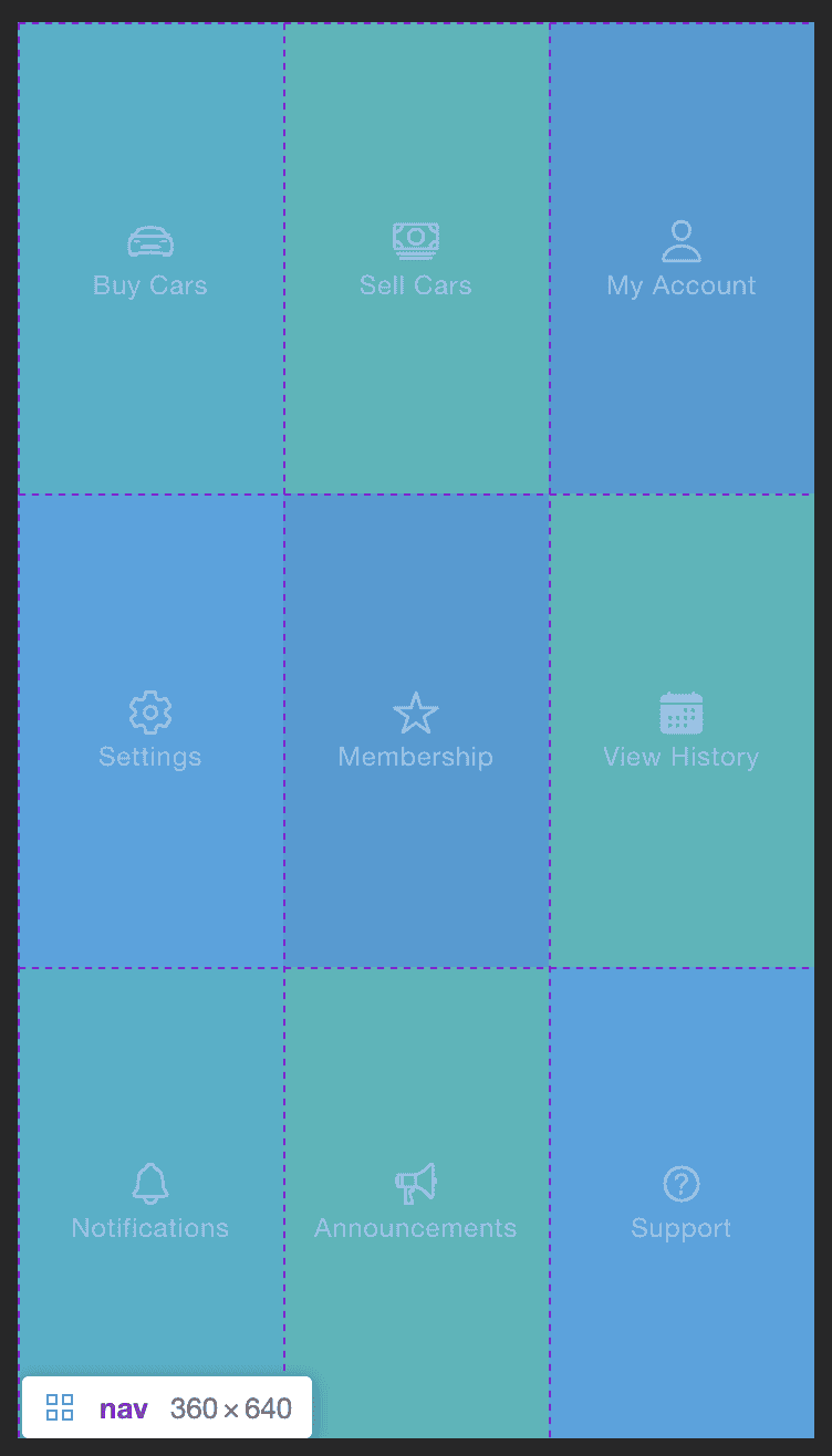
We will of course dive more into what exactly CSS Grid and Flexbox are in just a moment, but I want to try to give a little bit of context first. Consider the example we used in the lesson on navigation. I built an (intentionally bad) full page navigation that looked like this:
I'm hovering over the navigation element in Chrome DevTools which will highlight the grid for us. Those dashed purple lines highlight the edges of the cells of our CSS Grid - in this case we have a 3x3 grid giving us 9 cells in total. That means if I put nine elements inside of this grid it is going to fill up those nine cells. But we also might want to do some positioning on the items within those cells. In this case, we want the icon and title to be centered both horizontally and vertically within the cell. This is where we might also use Flexbox on the items inside the cells to do some layout/positioning at a more micro level. This isn't always how you will do things, sometimes you will use just CSS Grid, or just Flexbox, and sometimes you will use both - it's just a general rule to keep in mind.
It is also worth knowing that the Ionic grid component that we have covered over the last couple of lessons relies on using Flexbox. Although you can use the grid component without having to understand what is happening behind the scenes, we can further improve our use of the grid component by specifying our own flex properties, and we can also use Flexbox completely independently of the grid component. Again, I think it is generally better to use CSS Grid instead of the Ionic grid component, but we will still cover how Flexbox interacts with Ionic's grid component in this lesson.
A Brief Introduction to CSS Grid
At a basic level, CSS Grid allows us to create a grid to position elements on the screen. The common analogy used is to imagine cells in an Excel spreadsheet. The example we just looked at above is like having a 3x3 spreadsheet and we are inserting content into the cells of that spreadsheet. Let's take a look at how that layout works exactly. The navigation is defined in the template like this:
<ion-content>
  <nav>
    <ion-tab-button>
      <ion-icon name="car-sport-outline"></ion-icon>
      <ion-label>Buy Cars</ion-label>
    </ion-tab-button>
    <ion-tab-button>
      <ion-icon name="cash-outline"></ion-icon>
      <ion-label>Sell Cars</ion-label>
    </ion-tab-button>
    <ion-tab-button>
      <ion-icon name="person-outline"></ion-icon>
      <ion-label>My Account</ion-label>
    </ion-tab-button>
    <ion-tab-button>
      <ion-icon name="settings-outline"></ion-icon>
      <ion-label>Settings</ion-label>
    </ion-tab-button>
    <ion-tab-button>
      <ion-icon name="star-outline"></ion-icon>
      <ion-label>Membership</ion-label>
    </ion-tab-button>
    <ion-tab-button>
      <ion-icon name="calendar"></ion-icon>
      <ion-label>View History</ion-label>
    </ion-tab-button>
    <ion-tab-button>
      <ion-icon name="notifications-outline"></ion-icon>
      <ion-label>Notifications</ion-label>
    </ion-tab-button>
    <ion-tab-button>
      <ion-icon name="megaphone-outline"></ion-icon>
      <ion-label>Announcements</ion-label>
    </ion-tab-button>
    <ion-tab-button>
      <ion-icon name="help-circle-outline"></ion-icon>
      <ion-label>Support</ion-label>
    </ion-tab-button>
  </nav>
</ion-content>
With CSS Grid, all we need to do to get those elements positioned how we want is to define a grid on the <nav> element:
nav {
  display: grid;
  height: 100%;
  grid-template-columns: repeat(3, 1fr);
  grid-template-rows: repeat(3, 1fr);
}
Any child elements of nav will now automatically conform to the grid. This is why I generally recommend CSS Grid over the Ionic grid component - we would need to add a whole lot more elements in the template to achieve the same thing with the Ionic grid component, and it's not as flexible as CSS Grid is.
Let's take a closer look at what is going on here:
grid-template-columns: repeat(3, 1fr);
grid-template-rows: repeat(3, 1fr);
Part of this probably makes sense right away: we have columns and rows and we want to define how many rows and columns there should be. But then we are using repeat and 1fr which might look a bit weird. The repeat used here is just a helper, we are saying we want to repeat the 1fr value 3 times. We could also write this same rule like this:
grid-template-columns: 1fr 1fr 1fr;
grid-template-rows: 1fr 1fr 1fr;
The fr here is a special unit for CSS grid which represents a fractional unit of space. You can consider this to be the fraction of the total space available (which is dynamic) that that column should receive. If you are already familiar with Flexbox, this is similar to the flex property. Since we have used:
grid-template-columns: 1fr 1fr 1fr;Each column is given the same fraction of the space. If the grid element is 300px wide then each column will be 100px. The same goes for our rows since we are using the same rule. However, the cells don't all have to be the same size.
If we wanted the middle row of buttons to be twice as large as the others we might do this:
grid-template-rows: 1fr 2fr 1fr;In this case, if the grid was 400px tall the first and third rows would be 100px tall, but the second row would be double that at 200px tall.
What we have looked at above isn't actually how you will typically use CSS Grid. A lot of the time we aren't slotting content into a known/fixed number of spaces. We have a dynamic amount of content and we want it to just all flow correctly on the page no matter how much of it there is.
A good example of this, and something we will be taking a closer look at in the next lesson, is adapting a layout from mobile to desktop/tablet. Consider a situation where you have some <ion-card> components in a list. This is fine for a typical phone layout because one card which will just appear after the next in a long vertical list.
However, on a larger/wider screen you don't want to just expand the card to fill the layout. On a phone it will look fine:
Thanks for checking out the preview of this lesson!
You do not have the appropriate membership to view the full lesson. If you would like full access to this module you can view membership options (or log in if you are already have an appropriate membership).


