Controlling the Layout
Techniques for creating dynamic layouts
PROModule Outline
- Source Code & Resources PRO
- Lesson 1: Introduction PUBLIC
- Lesson 2: The Difference Between UI and UX PUBLIC
- Lesson 3: General Concepts PUBLIC
- Lesson 4: A Brief Introduction to Accessibility PRO
- Lesson 5: Navigation Concepts PRO
- Lesson 6: Actual Performance & Perceived Performance PRO
- Lesson 7: Controlling the Layout PRO
- Lesson 8: Utilising CSS Grid & Flexbox PRO
- Lesson 9: Creating a Layout That Adapts to Desktop PRO
- Lesson 10: CSS Variables and Syntactically Awesome Style Sheets (SASS) PRO
- Lesson 11: Improving Form UX PRO
- Lesson 12: Animating with CSS PRO
- Lesson 13: Animating with Angular PRO
- Lesson 14: Animating with Ionic and the Web Animations API PRO
- Lesson 15: Animating with Javascript PRO
- Lesson 16: Scalable Vector Graphics (SVG) PRO
- Lesson 17: Conclusion PRO
Lesson Outline
Controlling the Layout
Ionic's components are responsive, so when we are piecing our application together it is going to work on all supported devices regardless of the type or size of that device. If we are just designing for a portrait phone screen then we rarely have to worry about layout, as everything generally just appears one thing after the next in a long list. We might still want to control the positioning of different items, but the layout as a whole isn't generally something we need to worry about.
However, just designing the application with one device in mind is rarely going to lead to the best user experience. We have to consider that on devices like iPads or even desktop browsers we have a lot more space that we can utilise, and we also need to keep in mind that the situations in which a user might use those devices will be different as well.
Before beginning the next few lessons, it might be worthwhile to watch one of my public videos where I interviewed a UX Engineer from Sworkit (one of Ionic's most popular showcase application): What the best Ionic apps are doing that you're not | Sworkit and OneGoal with Cory McArthur. This covers a lot of important UX concepts at a high-level, especially with regard to layout and different devices.
In the next few lessons, we are going to cover some concepts that can help us create complex and dynamic layouts that change based on the environment that the application is running in. In this lesson we are going to focus primarily on Ionic components and APIs that can help us control the layout, in the next lesson we will focus more generally on utilising CSS Grid and Flexbox for layout, and in the lesson after that we will look at a practical example of an Ionic application that adapts from mobile to desktop.
Using the Grid Component
NOTE: I am going to walk through how to use Ionic's own grid component, but in general I recommend not using it. Not because there is anything wrong with it, and perhaps you will find situations where you want to use it or where you prefer using it, but because CSS Grid is a newer and more powerful option that is baked directly into the browser. Generally speaking, a layout that you build with Ionic's grid component could be built far more simply with CSS Grid. CSS Grid is a bit more difficult to understand initially, but you will be better off in the long run for having spent some time learning it.
The grid component allows us to create layouts by positioning elements on the page inside of a grid. If you're familiar with using grid based CSS frameworks like Bootstrap or the 960 Grid System then the grid component will probably feel pretty familiar to you. The basic concept is this:
- The screen is split up into
12columns of equal width (it does not have to be 12 columns, but this is the default) - Rows are added inside of the grid and are stacked on top of each other vertically
- Columns are added inside of rows and take up space horizontally. By default, all columns will be given an equal width and expand to fill the entire row, but you can also manually specify how many of the
12columns a particular column should occupy.
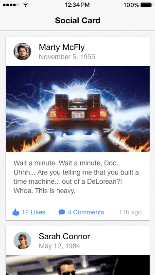
Using this approach we can create simple or extremely complex layouts with rows and columns. A basic use of the grid system might look something like this:
<ion-grid>
  <ion-row>
    <ion-col>
      <ion-button fill="clear" size="small">
        <ion-icon slot="start" name="thumbs-up"></ion-icon>
        <div>12 Likes</div>
      </ion-button>
    </ion-col>
    <ion-col>
      <ion-button fill="clear" size="small">
        <ion-icon slot="start" name="text"></ion-icon>
        <div>4 Comments</div>
      </ion-button>
    </ion-col>
    <ion-col align-self-center>
      <ion-note> 11h ago </ion-note>
    </ion-col>
  </ion-row>
</ion-grid>
It's just a grid with a single row and three columns to organise these elements side by side. However, e can get a lot more complex than that. You can nest rows and columns as much as you need to create your layout. If you have a row you could split that up into three columns. Then in the second column you could add another two rows inside of that. Inside of one of those rows you could again split that up into 4 more columns. This would look something like this:
<ion-grid>
  <ion-row>
    <ion-col> </ion-col>

    <ion-col>
      <ion-row>
        <ion-col></ion-col>
        <ion-col></ion-col>
        <ion-col></ion-col>
        <ion-col></ion-col>
      </ion-row>
      <ion-row>
        <ion-col></ion-col>
        <ion-col></ion-col>
        <ion-col></ion-col>
        <ion-col></ion-col>
      </ion-row>
    </ion-col>

    <ion-col> </ion-col>
  </ion-row>
</ion-grid>
You can nest rows and columns as much as you like to create whatever complex layout you need. There is a point where this can become a bit absurd, if you are creating more than a couple levels of nesting then it may be the case that your layout is too complicated, but the power is there to do it.
Thanks for checking out the preview of this lesson!
You do not have the appropriate membership to view the full lesson. If you would like full access to this module you can view membership options (or log in if you are already have an appropriate membership).


