Creating a Layout That Adapts to Desktop
An example UI that adapts to desktop
PROModule Outline
- Source Code & Resources PRO
- Lesson 1: Introduction PUBLIC
- Lesson 2: The Difference Between UI and UX PUBLIC
- Lesson 3: General Concepts PUBLIC
- Lesson 4: A Brief Introduction to Accessibility PRO
- Lesson 5: Navigation Concepts PRO
- Lesson 6: Actual Performance & Perceived Performance PRO
- Lesson 7: Controlling the Layout PRO
- Lesson 8: Utilising CSS Grid & Flexbox PRO
- Lesson 9: Creating a Layout That Adapts to Desktop PRO
- Lesson 10: CSS Variables and Syntactically Awesome Style Sheets (SASS) PRO
- Lesson 11: Improving Form UX PRO
- Lesson 12: Animating with CSS PRO
- Lesson 13: Animating with Angular PRO
- Lesson 14: Animating with Ionic and the Web Animations API PRO
- Lesson 15: Animating with Javascript PRO
- Lesson 16: Scalable Vector Graphics (SVG) PRO
- Lesson 17: Conclusion PRO
Lesson Outline
Creating a Layout That Adapts to Desktop
In the last lessons, we covered some concepts that we could use to create dynamic layouts that adapt to different devices and screen sizes. However, an important consideration is how our application should behave when accessed through a desktop browser.
If you are happy to just serve your "tablet" application experience through the desktop browser (e.g. split pane and a layout adapted for larger screens) then this is the ideal situation. Ionic is great for building mobile/tablet application experiences, and the user interface will be consistent with what users expect from those kinds of applications.
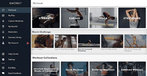
However, if you want your application to look like a mobile/tablet application on phones/tablets, but a "normal website" when accessed through a desktop browser you are going to have a harder time. Ionic at its core is a collection of user interface components for replicating mobile iOS/Android design patterns on the web; if you don't want iOS/Android design patterns then Ionic isn't really helping you here. Ionic works well by default here when your users are expecting an "application" because this still looks like what the user would expect when served at a full screen size. Take the Sworkit dashboard as an example from the video I linked previously:
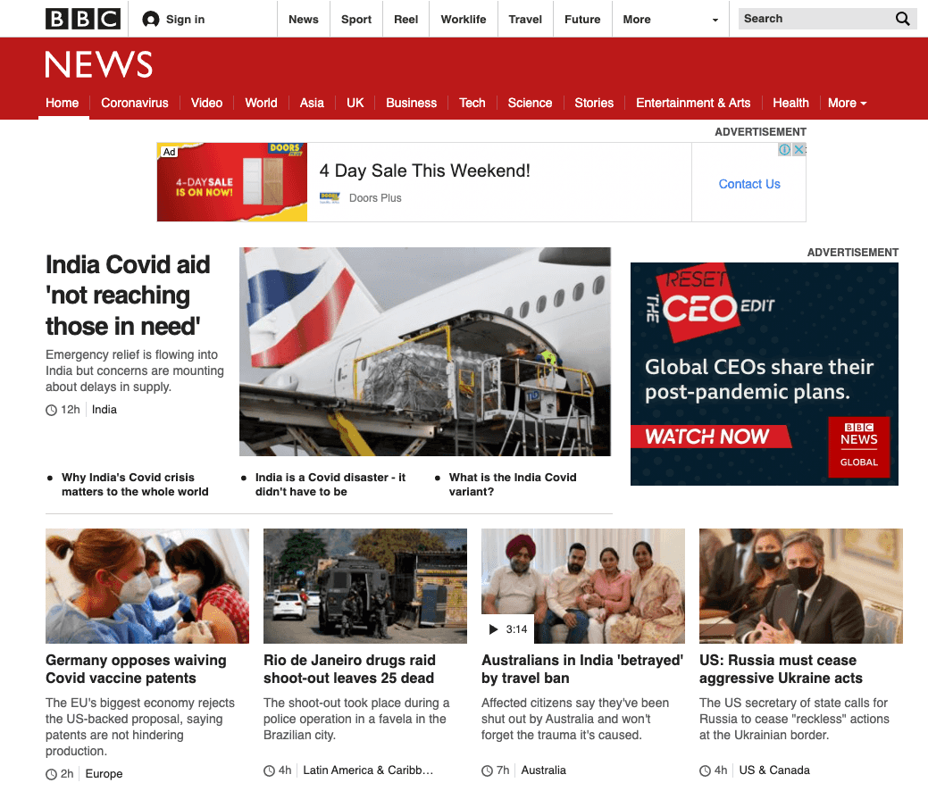
This looks great, but it looks like an "app". This would work well for the Sworkit application because that is what people are expecting, but if we continue our newspaper example users might be expecting something that looks more like a traditional news website when they access it through their desktop browser:
It should look like a website, not an application. To put it bluntly, this is just hard to do with Ionic. If you really want that website style experience then I think your best bet is likely designing an entirely separate user interface without Ionic. Most of the code/business logic for your application is built with Angular anyway, so it's not like you are throwing everything out, but it does make the project more complex as you will be maintaining two separate interfaces. One good way to manage this would be to create a monorepo that contains both projects. This would allow you to have two separate "apps" (your mobile app, and the website app) that can easily share a lot of the same components and logic. Still, this will be no easy task.
What we are going to do in this lesson is look at how we can make some basic changes to our existing layout so that it adapts to a desktop layout automatically. We can detect when the application is running on a desktop browser by using Ionic's Platform API, so we can use that to modify the style of our application. Theoretically, you could take this pretty far and highly customise the desktop experience to an extreme degree, but in general I would recommend either just making a few quality of life improvements for desktop or just bite the bullet and go for the full separate application approach for the website. If you try to massage the Ionic application too much into something it is not you are probably just going to create problems for yourself, and you'll probably end up going to fully custom route in the end anyway.
We are going to keep working with our simple wireframe of a newspaper layout, and see what we can do to make the experience a little more "website" like. We aren't going to try to make this look pretty, we are just interested in the layout and style changes that are relevant to a desktop specific experience.
Set up Some Test Data
Before we get started, we will need some test data so that we can display a bunch of news articles in the layout. If you want to follow along with the example I am building, then you will just need to set up a page that looks like this:
import { Component, OnInit } from '@angular/core';
import { Platform } from '@ionic/angular';

@Component({
  selector: 'app-home',
  templateUrl: 'home.page.html',
  styleUrls: ['home.page.scss'],
})
export class HomePage implements OnInit {
  public stories: Record<string, string>[] = [];
  public isDesktop = false;

  constructor(private platform: Platform) {
    this.stories = [
      {
        title:
          'Door Handles Mysteriously Vanishing Leaves Thousands Trapped in Rooms',
        author: 'Joshua Morony',
      },
      { title: 'Are Your Shorts Out to Get You?', author: 'Joshua Morony' },
      {
        title: 'IE8 Default Browser for New iPhone 9',
        author: 'Joshua Morony',
      },
      {
        title: 'The Secret Health Benefits of Muffins',
        author: 'Joshua Morony',
      },
      {
        title: 'Curfew Implemented as IE8 Riots Continue',
        author: 'Joshua Morony',
      },
      { title: 'Mysterious Object Eclipses Sun', author: 'Joshua Morony' },
      {
        title: 'Is Your Spouse Having an Affair with an AI?',
        author: 'Joshua Morony',
      },
      {
        title: 'Tourism Plummets as Virtual Holidays Gain Popularity',
        author: 'Joshua Morony',
      },
      {
        title:
          'Does This Adelaide Man Have the Secret Formula for Winning the Lottery?',
        author: 'Joshua Morony',
      },
    ];
  }

  ngOnInit() {}
}
I've also set up the following styles to make the example look a little nicer.
Modify src/app/home/home.page.scss to reflect the following:
.story-headline {
  background-color: var(--ion-color-light);
  white-space: normal;

  h2 {
    font-size: 1.5em;
    font-weight: bold;
  }
}

.story-content {
  padding: 20px !important;
  font-family: georgia, 'times new roman', times, serif;

  img {
    float: left;
    width: auto;
    margin-right: 20px;
    margin-bottom: 10px;
    border: 3px solid var(--ion-color-light);
  }

  p {
    margin: 20px 0;
  }
}

.author {
  text-transform: uppercase;
  font-size: 0.8em;
  opacity: 0.5;
}
We are also going to include a menu with split pane for this layout, so let's set up some styles for that.
Modify src/global.scss to include the following:
ion-menu {
  ion-item {
    font-weight: bold;
    margin: 20px;
  }
}
We will also need to create the side menu in our root components template.
Modify src/app/app.component.html to reflect the following:
<ion-app>
<ion-menu contentId="main" side="start">
<ion-content>
<ion-list lines="none">
<ion-menu-toggle auto-hide="false">
<ion-item button>
<ion-label>World</ion-label>
</ion-item>
</ion-menu-toggle>
<ion-menu-toggle auto-hide="false">
<ion-item button>
<ion-label>Politics</ion-label>
</ion-item>
</ion-menu-toggle>
<ion-menu-toggle auto-hide="false">
<ion-item button>
<ion-label>Business</ion-label>
</ion-item>
</ion-menu-toggle>
<ion-menu-toggle auto-hide="false">
<ion-item button>
<ion-label>Opinion</ion-label>
</ion-item>
</ion-menu-toggle>
<ion-menu-toggle auto-hide="false">
<ion-item button><ion-label> Tech</ion-label> </ion-item>
</ion-menu-toggle>
<ion-menu-toggle auto-hide="false">
<ion-item button>
<ion-label>Food</ion-label>
</ion-item>
</ion-menu-toggle>
<ion-menu-toggle auto-hide="false">
<ion-item button>
<ion-label>Health</ion-label>
</ion-item>
</ion-menu-toggle>
<ion-menu-toggle auto-hide="false">
<ion-item button>
<ion-label>Travel</ion-label>
</ion-item>
</ion-menu-toggle>
</ion-list>
</ion-content>
</ion-menu>
<ion-router-outlet id="main"></ion-router-outlet>
</ion-app>Thanks for checking out the preview of this lesson!
You do not have the appropriate membership to view the full lesson. If you would like full access to this module you can view membership options (or log in if you are already have an appropriate membership).


