Building a Skeleton Card Component
Using a custom component to hold a simple template
PROModule Outline
- Source Code & Resources PRO
- Lesson 1: Introduction PUBLIC
- Lesson 2: The Role of Components and Directives PUBLIC
- Lesson 3: When to Use Custom Components & Directives PRO
- Lesson 4: Building a Simple Component PRO
- Lesson 5: Building a Simple Directive PRO
- Lesson 6: Setting up Components and Directives PRO
- Lesson 7: Using @Input and @Output PRO
- Lesson 8: Using ElementRef and Renderer PRO
- Lesson 9: Understanding Content Projection PRO
- Lesson 10: Understanding @ViewChild and @ContentChild PRO
- Lesson 11: Building a Complex Component PRO
- Lesson 12: Listening for Events and Binding to Properties PRO
- Lesson 13: Building a Skeleton Card Component PRO
- Lesson 14: Creating an Autogrow Directive for a Textarea PRO
- Lesson 15: Handling Error Messages with a Custom Component PRO
- Lesson 16: Building a Parallax Header Directive PRO
- Lesson 17: High Performance Accordion Component PRO
- Lesson 18: Conclusion PRO
Lesson Outline
Building a Skeleton Card Component
In the following lessons we are going to focus on building some example custom components and directives - some will be fairly basic (like this one) and some will be more advanced. In each case, we will just be focusing on building the component or directive itself - not how to integrate it into the application. Since there are different ways to include components and directives in your application, depending on how your application is set up and how you wish to include them (as discussed in the Setting up Components and Directives lesson), you should use which ever method suits you best. If you are having trouble with appropriately setting up the component or directive in your application, you can also refer to the Resources lesson which will contain links to working examples of all of these components and directives.
In this lesson, we are going to create a custom component that will allow us to easily drop a "Skeleton Card" anywhere we would like. We use this concept in the Hangz application built in the NoSQL module, and we will also discuss it at length in the UI/UX module.
Although there was no built-in component for this when I originally wrote this module, the Ionic team have since released their own <ion-skeleton-text> component to help achieve this. If you were adding this functionality to your own application you might want to make use of that component, but for the sake of learning how to build our own components, we are going to build this thing from scratch without using the <ion-skeleton-text> component.
We will mostly be focusing on building the component in this lesson, but to give you some context, we want to place some placeholder content temporarily on the screen to make the user feel like the application is loading quickly.
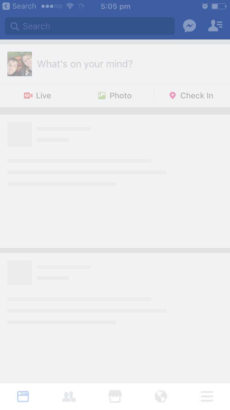
Facebook uses this concept, and will display a bunch of empty boxes with gray bars whilst content is loading:
Once the content is loaded, these boxes will be replaced by the real content. We will be aiming to create a component that would allow us to just drop the following:
<app-skeleton-card></app-skeleton-card>Thanks for checking out the preview of this lesson!
You do not have the appropriate membership to view the full lesson. If you would like full access to this module you can view membership options (or log in if you are already have an appropriate membership).


