Creating a Modern Firebase Powered Application with TDD
Use reactive programming and tests to build a professional app
More Styling
Refinements before delivery
PROModule Outline
- Source Code & Resources PRO
- Lesson 1: Introduction PUBLIC
- Lesson 2: The Structure of this Module PUBLIC
- Lesson 3: [Sprint One] Setting up Firebase PUBLIC
- Lesson 4: [Sprint One] Creating Security Rules with TDD PRO
- Lesson 5: [Sprint One] Testing Authentication PRO
- Lesson 6: [Sprint One] Component Store PRO
- Lesson 7: [Sprint One] Circumventing Firebase Authentication for E2E Tests PRO
- Lesson 8: [Sprint Two] Displaying Client List from Firestore PRO
- Lesson 9: [Sprint Two] - Adding Clients PRO
- Lesson 10: [Sprint Two] - Editing Clients PRO
- Lesson 11: [Sprint Two] - Client Details PRO
- Lesson 12: Preparing for Delivery PRO
- Lesson 13: Configuring for Production PRO
- Lesson 14: [Sprint Three] - Refactoring PRO
- Lesson 15: [Sprint Three] Setting up PWA PRO
- Lesson 16: [Sprint Three] Logout PRO
- Lesson 17: [Sprint Three] Delete a Client PRO
- Lesson 18: [Sprint Three] - Feedback Mechanism PRO
- Lesson 19: [Sprint Three] View Feedback PRO
- Lesson 20: More Styling PRO
- Lesson 21: [Sprint Four] - Refactoring Feedback PRO
- Lesson 22: [Sprint Four] - Feedback Dates PRO
- Lesson 23: [Sprint Four] - Client Survey PRO
- Lesson 24: [Sprint Four] - View Survey PRO
- Lesson 25: Final Touches PRO
- Lesson 26: Conclusion PRO
Lesson Outline
We've finished with all of the items for our third sprint, but if we actually take a look at our work...
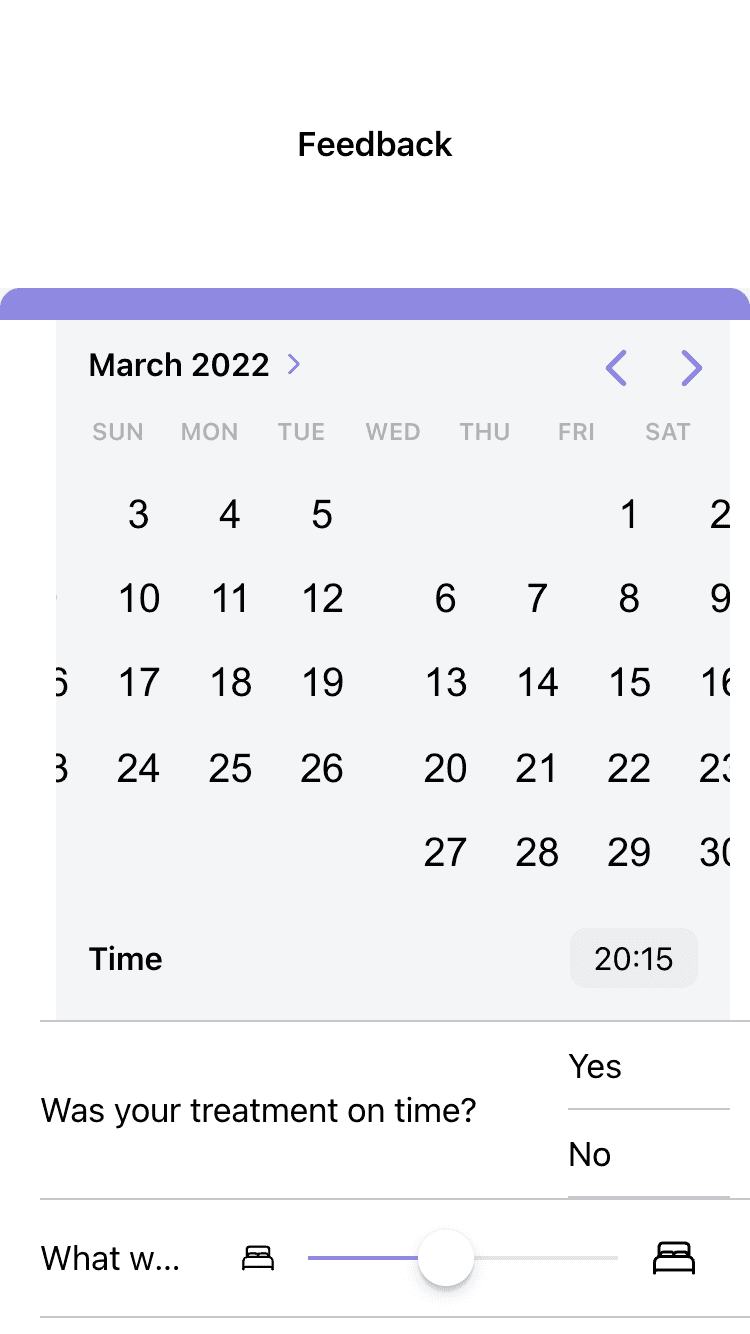
The form, as one example, looks terrible. Again, we have just been focusing on satisfying the functionality - now we are going to take some times to polish things up a bit. Since we have our tests in place, we can refactor at will without adding new tests, as long as we aren't adding any new functionality.
The other features we have implemented are a bit more useable than the form, but they still don't look good (the view feedback functionality for the massage therapist provides a similarly poor experience). Just like last time, we're not aiming to have that final production quality polish on the UI just yet, but we do want something that is generally useable and looks nice.
Project management
Make sure to create the an issue for this work, e.g:
refactor: improve styling for sprint 3 featuresand also create a new task branch for this work.
Before we get started, here's a list of the stuff I want to address after using the application for a little bit:
- Improve feedback form styling
- Improve view feedback styling (both the list and detail pages)
- When logging in, the background of the home page transitions weirdly when moving to the clients page
- The client list briefly flashes when adding a new client
- The 'Delete Client' button needs better styling
Now let's get into it!
Add a TrackBy Function
We are first going to deal with the client list flashing when we add a new client. This isn't a huge deal, but the list re-rendering is one of those little details that makes the app feel kind of buggy.
We are going to solve this by adding a trackBy function to our client-list component:
export class ClientListComponent {
  @Input() clients: Client[];

  constructor() {}

  trackByFn(index: number, client: Client) {
    return client.id;
  }
} <ion-item
*ngFor="let client of clients; trackBy: trackByFn"
button
routerLink="/clients/{{ client.id }}"
routerDirection="forward"
>
<ion-label>{{ client.name.first }} {{ client.name.last }}</ion-label>
</ion-item>The idea is that we give Angular a unique value (the client id in this case) that it can use to keep track of that particular item in an *ngFor loop. This means that when a new item is added, Angular will be able to figure out how to add the new item to the DOM without affecting the others. Without trackBy in this case, Angular needs to re-render the entire list.
The Delete Client Button
This is another easy change, we will just modify the styles for our delete button on the client-detail page:
    <ion-button
      data-test="delete-button"
      class="delete-client"
      color="primary"
      fill="outline"
      (click)="deleteClient(vm.client)"
    >
      <ion-icon name="trash"></ion-icon> Delete Client
    </ion-button>
Notice that we have added a delete-client class here. We could target this element using the data-test attribute, but that defeats the purpose of having data-test. We want our testing selectors to be separated from the applications styling.
ion-card {
  ion-item {
    --padding-start: 0;
    font-size: 0.8em;
  }
}

.delete-client {
  width: 100%;
}
The Home Page
On iOS when we log in the view will transition in from the right. It will go over the top of the previous view, and then once it is fully in place the old view will be removed. The problem we are facing is that we have this big transparent area in the header, which means that we can see through our new page into the old page, which makes the transition jarring.
This just requires a slight tweak in our global.scss:
Thanks for checking out the preview of this lesson!
You do not have the appropriate membership to view the full lesson. If you would like full access to this module you can view membership options (or log in if you are already have an appropriate membership).

